This code plots warming stripes and a linegraph, based on average temperature (eg. a given column in a .csv file)
In: .cvs file with date in YYYYMMDD-format and temperature (in this case column 'TG'. This file is generated by the KNMI in the Netherlands
Options : Mode = "year_avg" (average of daily average per year) or "spec_day" (daily average on a certain day in the year eg. X-mas eve)
Out: Barplot and a line plot.
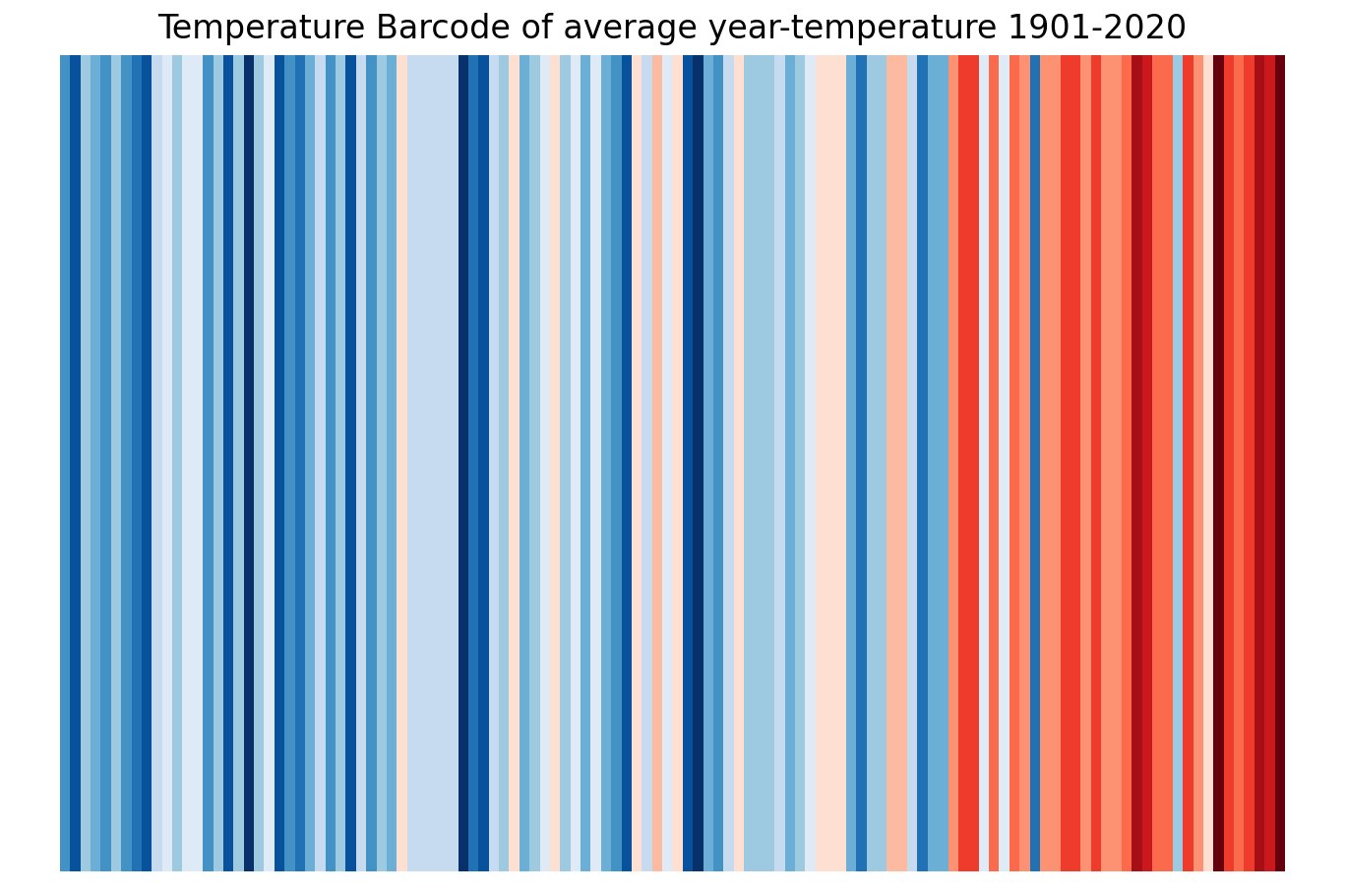
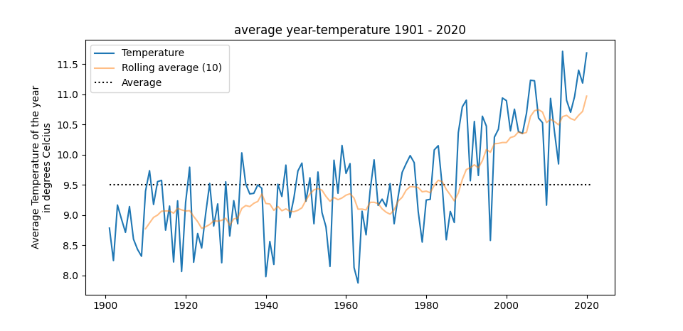
Warming stripes plot based on code of Sebastian Beyer : https://github.com/sebastianbeyer/warmingstripes/blob/master/warmingstripes.py